Making Wine Maps: An Interview With Remy Giannico
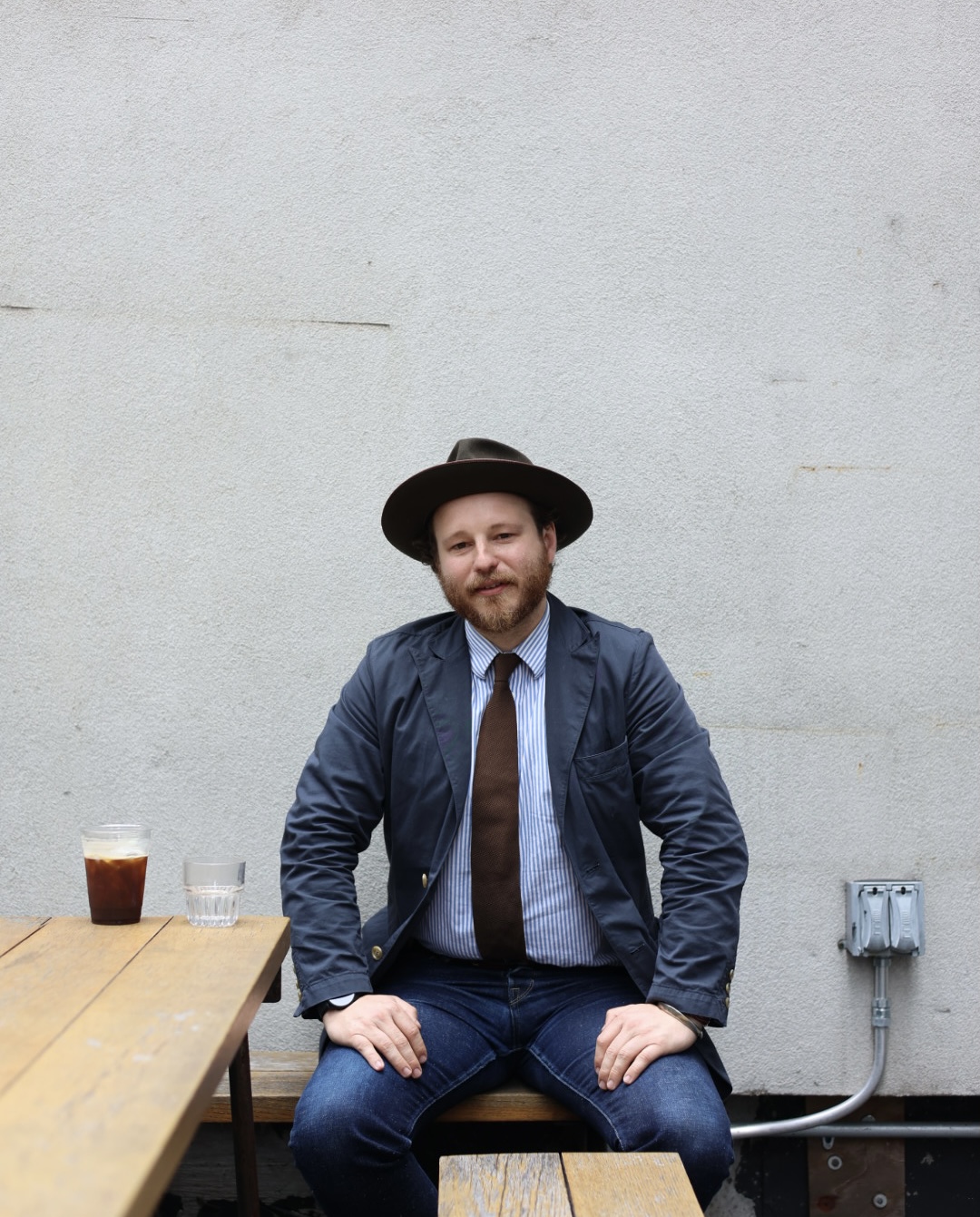
Remy Giannico is a man in the wine world I’ve been delighted to get to know. Not only is he fun to be around, but he also sells some of the best wines on the market with Grand Cru Selections and spends his free time turning out some of the most interesting maps I’ve ever seen.
As a cartographer, he works in two distinct map mediums: cutting-edge digital 3d interactive and the ancient art of copper etching (a favorite of Renaissance artists like Rembrandt), and in both, he is laser-focused on perspective.
I’ve always been fascinated by hand-drawn maps of real and imagined places; gentle hand-drawn outlines softly suggest the borders and features of a world. Through these maps, the world is given a richer form that indicates the history or importance of a given place. But in the digital maps that Remy makes, I’ve been shown a new application that I’ve never thought about, and I now have a newfound respect for perspective in mapmaking.
I recently sat down with him to discuss his journey to mapmaking, why all wine nerds seem to love maps, and (of course) perspective.
-Will
REMY GIANNICO x COMMUNITY WINE & SPIRITS
A conversation about mapmaking, digital perspective, and the art of copper etching.
Will C. Farley (WCF): Thanks for taking the time to sit down with me today. I love your digital maps for Grand Cru and the copper etchings you make. How did the worlds of cartography and wine come together for you?
Remy Giannico (RG): From childhood, I was always drawn to maps. I was obsessed with pirates. All the “x marks the spot” stuff was a huge part of the adventure. In college, I was studying economics and working at a wine bar, spending time learning about terroir through wine maps. I decided to take a geography class that changed everything for me.
The class touched on the same points all of us love when we study wine today professionally. It resonated, and I changed my major immediately, which exposed me to classes on cartography. I was building a career in wine and was able to bring cartography to it. I ended up transferring with a scholarship to U.C.S.B. [Will’s note: one of the most prestigious universities for geography in the United States.]
I started taking classes on soil science and cartography, learning about Geographic Information Systems (GIS), which taught me all about the modern art of cartography and how cartographic software works.
A few years later, I was working for a wine distributor in Santa Barbara, and Raj Parr [wine world renowned former sommelier, winemaker, and wine writer] was acting as my wine mentor. I was at his house every other day to taste wine with him. For a lot of people, visiting Raj was like a religious pilgrimage; they’d bring him these fancy bottles to open right away. I was getting a taste of all those wines and see the places they came from in the maps on his wall.
That was when I got a phone call from Grand Cru asking if I’d be willing to move to New York in two weeks! I said yes, moved, and then the pandemic happened just a few months later.
My original pitch was: We have incredible maps of Burgundy, but can you imagine if we saw every region like Burgundy?

WCF: When did you get into making your own wine maps and putting all your study into practice?
RG: During the pandemic, demand for wine was so backward. My original pitch was: We have incredible maps of Burgundy, but can you imagine if we saw every region like Burgundy? I refreshed myself on cartography and saw this as my chance to make maps that were designed around the wine industry.
In a way we are discoverers seeing new things in a place. And in wine, it’s important for us to talk about what makes a place special and reenvision the maps in a new way that highlights those special features.
WCF: You guys at Grand Cru have the best digital maps I’ve ever seen. Did you design them? (See some examples here, here, and here).
RG: I did all the interactive stuff! We also work with a great designer in Paris who does our flat maps, but I’ve been able to model other maps for newer growers in our portfolio who want to emulate what we’ve already done digitally.
WCF: The Poderi Colla map was my first taste of what you’re doing, and it’s so, so cool and is far and away the most detailed 3d wine map I’ve seen. Truly so much more than a Google or Apple map of a wine region. How do you choose what to include?
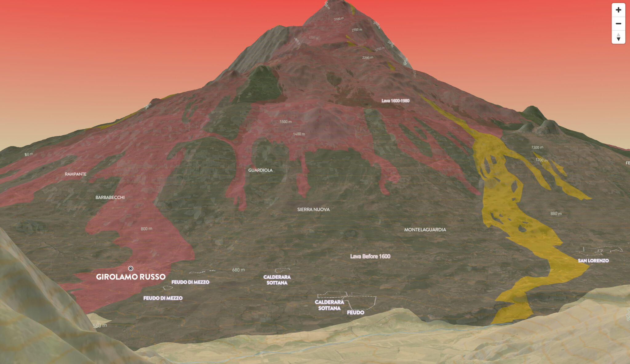
RG: Ultimately, my mission right now is to provide more perspectives than we’re getting elsewhere. There’s an oligarchy of cartography where a few major tech companies call the shots on where the lines go that define what surrounds us. It’s crazy, but these companies shape the way we see the world.
WCF: Yeah, it’s all context that we can use to interpret the world. It’s so telling what a mapmaker chooses to include or omit.
RG: Yeah, I mean, perspective is everything. It’s like writing, isn’t it? A writer also chooses what words to include to shape a story and then continue to pare it down.
WCF: Yeah, writing is editing. Again and again, honing and editing forever.
RG: When I’m designing my maps, I’m often thinking about being precise about the feelings that I get when tasting wines in these beautiful places.
Burgundy is the heart of the Grand Cru portfolio, and everything resonates from that Burgundian epicenter. Ultimately, if that region has taught us anything, it’s that place really matters, right? They’re intimately versed in their vineyard sites, and unlike most other parts of the world, you have different people sharing the same tiny plots of land.
WCF: Yeah, and they’ve had centuries to explore and innovate on specific sites. I think what I love about Burgundy is that you get multiple viewpoints into these postcard-sized plots of land, so the winemaker’s philosophy and intention really show through a wine.
RG: Right? It’s all perspective, and relevantly, it’s why there are so many detailed maps of the region, but people want to understand what a place feels like as much as where it comes from. Orientation will make that happen. My Burgundy map is oriented East / West instead of the traditional North / South. It’s like you just parked the car on the main road and looked west up the hill. Seeing it like that actually gives you a better understanding. You see the elevation, which is going to tell you a lot about the soils and the way things have moved on a geological scale; it gives you aspect and exposure.
“Ultimately, my mission right now is to provide more perspectives than we’re getting elsewhere. There’s an oligarchy of cartography where a few major tech companies call the shots on where the lines go that define what surrounds us. It’s crazy, but these companies shape the way we see the world.”
WCF: How did you get into the copper etching? With the art, do you strive for literal accuracy, or is it more philosophical or fantastical?
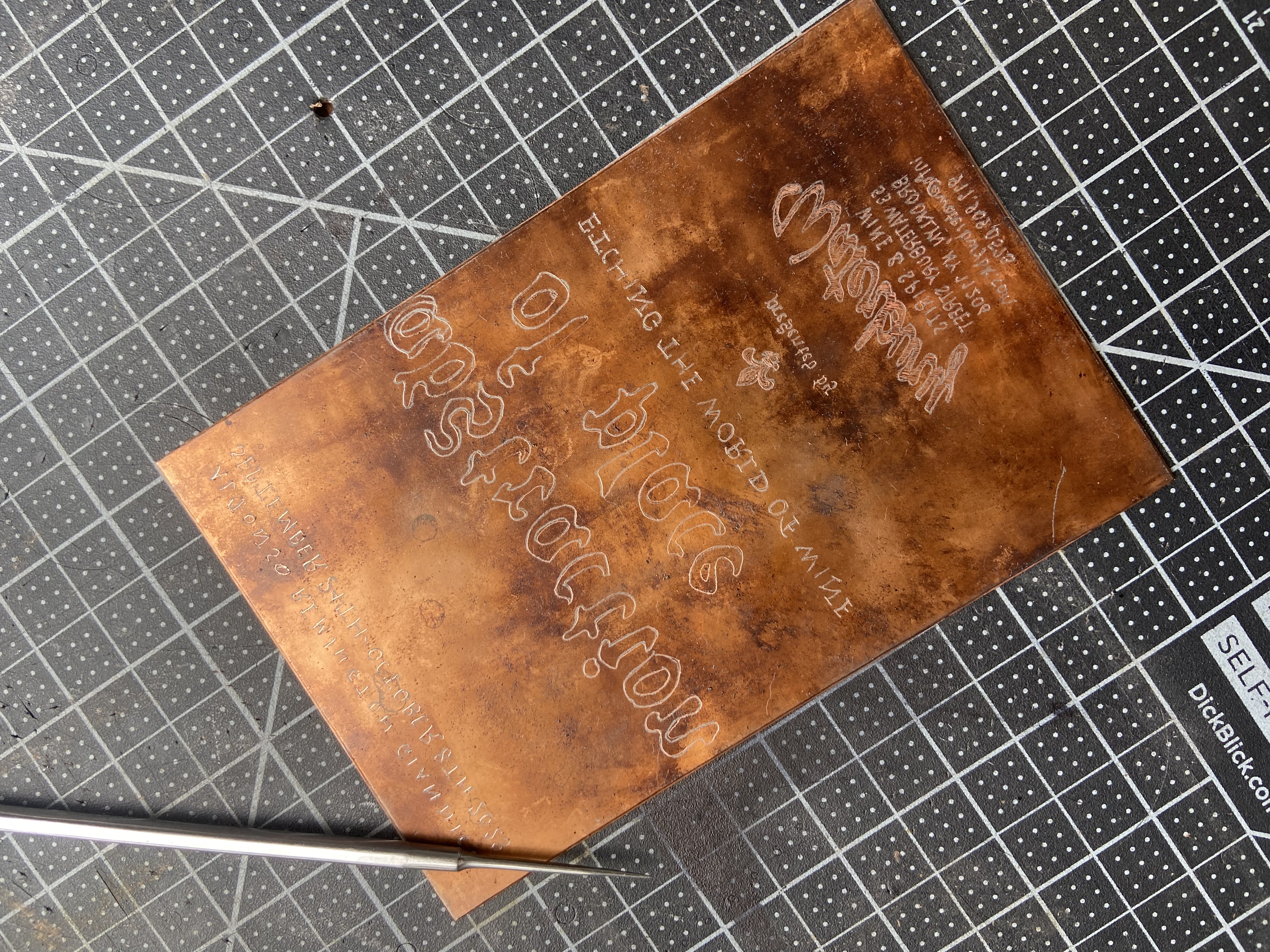
RG: The copper etching was entirely accidental. One block from my house is a print studio, and I stopped in to see if I could get some maps printed. I literally thought it was a regular printer! But it’s an amazing specialty print shop called Shoestring Press run by Erich Erving and Lane Sell, who are two master printers.
When I first walked in, a woman was fiddling with a piece of copper, and being a curious person, I asked about it. I talked to Eric about my interest in printing maps, but he pointed back to the copper and said that if I had been a cartographer in the Renaissance, I would have worked on these plates. I was so interested, and that led me to learn the art of copper etching.
WCF: How does it work?
RG: The maps are designed by etching on the plates before placing them in an acidic solution. With the tools we have now, it’s kind of amazing because I can etch a map with the same precision and geographical representation as a digital map.
A lot of people will sit down and draw maps precisely, but I don’t necessarily feel that they’re accurately portraying the place. But to me overlapping the old maps with the new ones is important for georeferencing.
WCF: What does the actual process look like?
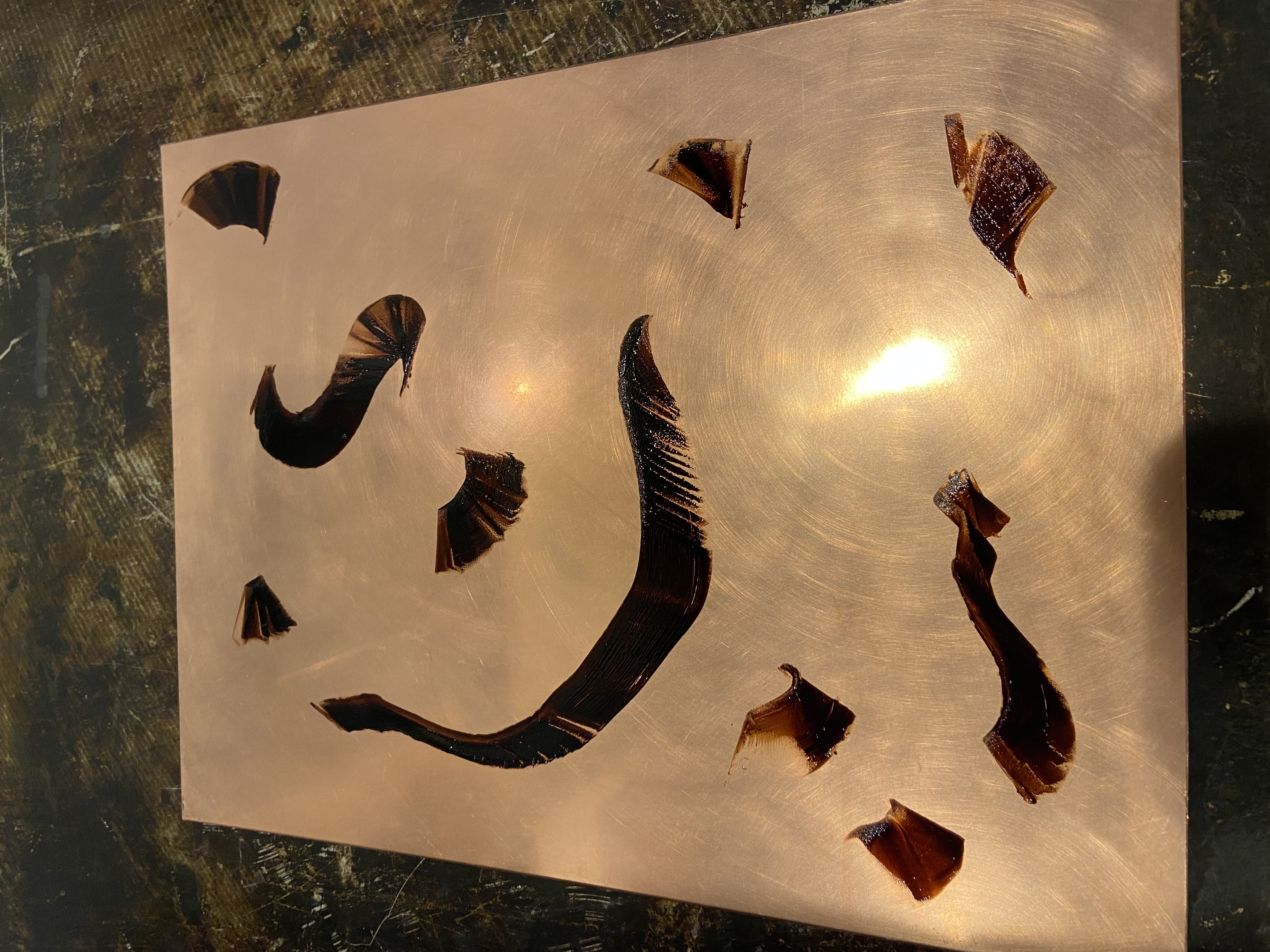
RG: So, the copper is covered in a substance called ground. I use a hard ground that’s a combination of wax and asphalt and smells incredible. It’s like the best fucking tobacco you’ve ever smoked. Once it’s hardened, I print a map on paper and then use carbon paper to transfer the design before hand etching it onto the ground that covers the plate. What’s left is exposed copper that you put in your acid solution where it leaves the imprint. It’s basically a reverse stamp. You push ink into the grooves, and when you press it, the grooves sit on top.
It’s funny that everything has to be done in reverse for the prints; I think about the reverse orientation, which is especially stark when making maps. I’ve had to teach myself how to write backward.
WCF: Is that why Renaissance artists famously wrote backward?
RG: Yeah, I think etching is probably part of that.
WCF: Is there a goal with this project? What’s next?
RG: I’m slowly starting to explore and develop an idea around expressionist cartography, to make people feel like the map lets you feel like you understand what a place feels like.
If I’m someone just getting interested in wine, you can point me at where a wine comes from, but it doesn’t give you anything more than just a general location. It doesn’t tell you about what the place is like, what it feels like. I was just in Argentina, and seeing the Uco Valley in its actual orientation changed everything. You can see why it’s cooler over here or warmer over there. You understand it intuitively.
WCF: What are some of the difficulties in mapmaking?
RG: The problem a lot of times with wine is that every narrative is very personal, and so to design maps that are somewhat custom to the region and call out sites for the top growers means you have to almost immediately deal with these powerhouses, massive producers who don’t want their sourcing to be chopped up. It gets political. We know somewhere like Brunello has some of the greatest terroirs, but the second you start to designate where vineyard sites are, you get in trouble.
WCF: So that’s why your maps are so focused on perspectives?
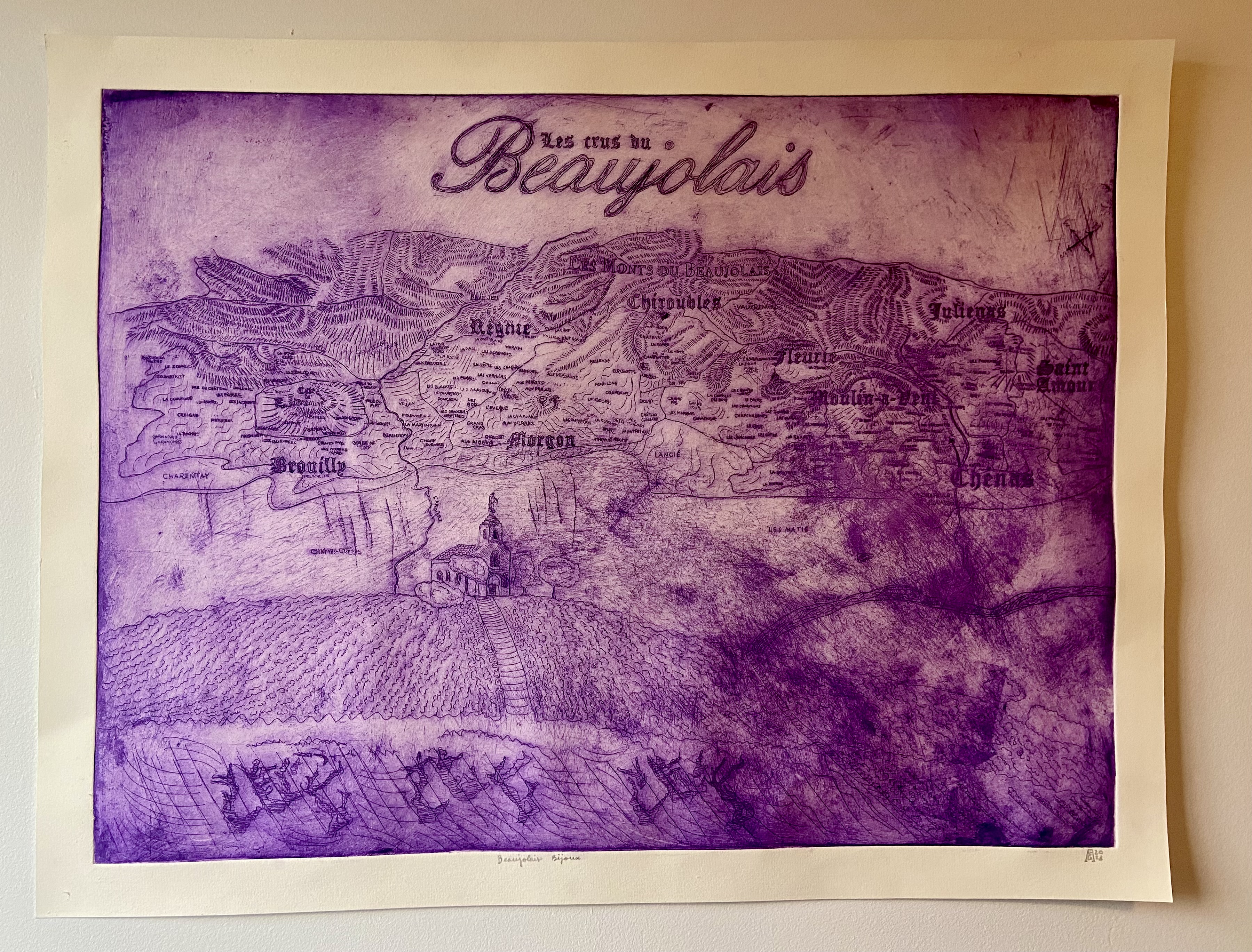
RG: Yes, exactly. There still hasn’t been a map of all the Lieu Dits in Beaujolais divided by crus. But when you understand what producers are actually next door to one another, seeing it side by side is when things start to make sense, and you have that Burgundy experience we were talking about.
WCF: I think something that many new wine drinkers have a hard time understanding is that vineyard sites don’t always (or even regularly) sit beside the winery.
RG: Totally, and as a mapmaker who cares about my producers, it’s hard because some growers are super sensitive about showing where they get their fruit. That fruit is so precious. To expose it and put it on a map, gives away where the treasure is, and people with more money can come in and buy it out from under you. It happened with Raj all the time.
WCF: Well, I hope that you can find the full balance between those two things. The maps you make, personally, as well as for Grand Cru, are so fantastic, and I love that you get time to do that.
RG: Me too! It’s important to the company; Robert [Bohr, owner of Grand Cru Selections] really loves maps. What other company has devoted this much money and resources to maps? There isn’t one.
WCF: And that’s what I love about y’all. And for you personally, I can’t wait to see what you do next and how we can do more interesting things at Community, too.

